
Source's Grid stack is perfect for both grids and columns on your sites. This stack sets up the functionality for the grid / columns and the actual content is added to the Grid Item child stacks.
Note: The Grid stack creates equal width columns. If you need more flexibility than this then you will need to use Grid Plus (or another third party solution).
Setup
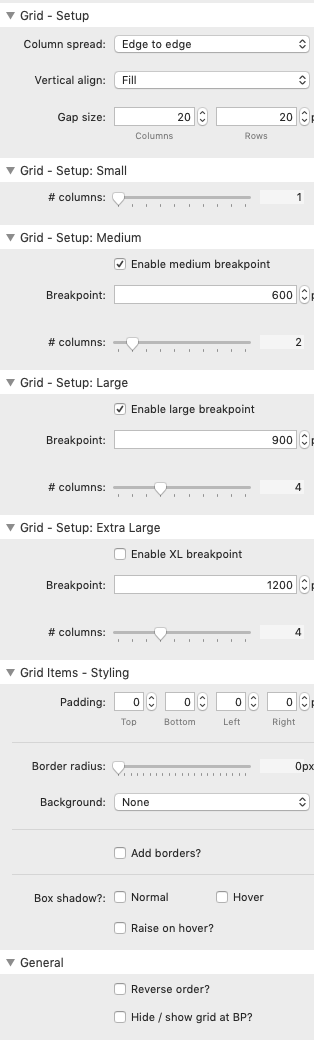
Column spread
Column spread allows you to select either 'Edge to Edge' or 'Centered'. This setting only really has a noticeable effect when you have columns that spill onto more than a single row.
Edge to Edge: This setting acts quite like a regular grid stack in that if a fourth item spills onto a second row (when 3 columns have been set to display), then it will appear directly under item 1 on the first row however a fifth item will appear in column 3.
Centered: With the same set up as described above, the fourth item would be centered within the second row (i.e. under item 2).
Vertical align
The default alignment is for 'fill' which makes all items in a row the same height.
The other options allow you to align the content by the tops, the bottoms or the centres of the items.
Note: The alignment within a column (when set to Fill) is controlled via the child item stack.
Gap size
You can specify how much of a gap you want between columns (and rows) by setting a height in pixels.
Note: When using centered, the set gap size for columns will be adjusted slightly to allow this to work.
Number of columns
You can specify how many columns you want to have at up to 3 breakpoints. The default is to have 1 column on small screens, 2 on medium and 3 on larger screens.
Enable (or disable) breakpoints to suit your needs.
Note: 2 Grid child items are added by default to the Grid stack. You will need to add as many additional child stacks as required for your content.
Grid Items Styling
You can opt to make some styling choices that will affect each child item. This includes adding padding, setting a background colour and borders.
You can also opt to add a shadow around each item. For the shadow to be seen you will need to have sufficient gaps between items and also sufficient padding around the grid itself.
There is also an option to 'Raise on hover' which makes your grid item shift a little when hovered over.
General
You can choose to reverse the order of the grid items. This means that the grid child item that is lowest down in the grid stack (in Edit mode) will appear in the first column. This is useful if you regularly add new items and want those to appear first.
You can additionally set the grid to be shown (or hidden) at a particular breakpoint.