
Splider 2 offers a very powerful and flexible way of styling your sliders. There are 4 dedicated styling stacks and these are accessed from the 'Splider styling' section of Splider stack (as shown in image below).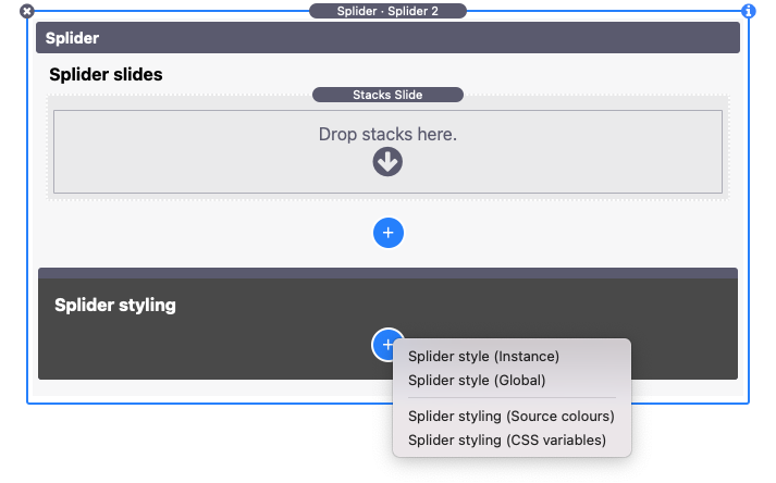
Note: You will only see the 'Source colours' option if you have Source framework in your Stacks library.
There are some basic styles applied as default (for things like navigation arrows and pagination dots) and, as such, and depending on your needs, you may not need / want to add any of these styling stacks. These styling stacks though let you take control over the styling of various elements, including:
- Slider padding
- Slide padding
- Border widths
- Border radius
- Background colours (for active and inactive slides)
- Navigation arrows styling
- Pagination dots styling
Note: The 'Splider style (Instance)' and 'Splider style (Global)' stacks both largely have the same settings - it is really just the 'scope' of each that differs.
Splider style (Global)
The Global stack can be used to set up default styling for all Splider stacks on the page. If you are using multiple sliders on the page and want them all to share the same look and feel then this is a great approach. It is also a useful one to create a Stacks Partial with as it then lets you easily share those same styles across multiple pages in your project. And even if you apply these global styles to all Splider sliders, you can override any individual Splider stack to have its own styling (using the Instance stack).
Note: Although you add the Global stack via a particular Splider stack - it is recommended that the stack is dragged out of the stack where it is added and placed up near the top of the page.
Splider style (Instance)
If you want to style a singe Splider stack then you can use the Instance version of the styling stack. It can also be used to override some settings that are set by the Global styling stack if you are also using that on the page.
Tip: Within each group of settings you can opt to either apply the stack settings or to ignore them and instead pick up the defaults (or those set by the Global stack). This means that you can pick and choose which particular elements you want to style and which to inherit from elsewhere.
Splider styling (Source colours)
If you use Source framework then there is an option to apply the Source colours against any / all of the slider elements. It can be used in Global or Instance mode depending on your needs (i.e. if you want to style all Splider stacks on the page with Source colours or only some).
Note: To use this you must first also have used one of the main Global or Instance styling stacks to set up the defaults.
Splider styling (CSS variables)
If you use a framework (like Source or F6) that make uses of CSS variables to set colour values then you can use these variables to apply those same colours to the slider elements. Like with the dedicated Source stack, this one can also be used in Global or Instance modes.
Note: To use this you must first also have used one of the main Global or Instance styling stacks to set up the defaults.