
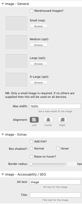
The Source image stack is a great way to add images to your pages. It allows you to add up to 4 different versions of an image so that an appropriately sized / cropped image is used on each device. This is a great way to improve performance as you don't just have to use the smallest possible image that will look good on a large device - you can instead select/create images that are appropriate for any device size that the web page is being viewed upon.
You can of course just use one version of an image if you want and this will be displayed on all devices. (It is really only banners / large images where you may wish to provide alternative sizes/aspect ratios/focal points etc).
If using only one image then it needs to be added to the 'Small' image settings.
Max-size
You are able to specify a max-width for any image added. You can use any units that you wish to though most often the default (of 100%) will be suitable. A max-width of 100% will fill the available space in the container (if the image is large enough to do so).
Alignment
You can set the alignment for the image either generally or for each of the breakpoints.
SEO / Accessibility
You can (and should) add an alt-tag for any image that you add. This is used by screen readers for those with visual impairments to describe the image.
You can also opt to add in a title. This will appear in a tooltip when the image is hovered over and is often looked for in SEO checks etc. Leave blank though if the image does not merit a title.