
Grid Plus Pro includes support for the grid-template-areas component of the CSS Grid specification. This powerful feature allows us to define areas in our grids and assign them a name. We can then tell any grid item that we add into the grid which named area we want it to occupy. This is a really useful approach when grid building as it allows us to alter the position of the different named areas (i.e. create different grid setups at different breakpoints) and have all of our grid items (that are attached to a grid position by name) automatically follow the newly stated positions.
An example
A common example of using grid-template-areas is to create a full page layout on desktop devices - where we fill the visible page with the different sections of our grid. On smaller devices we would typically just stack these different areas vertically. Here are the 2 grid templates that we would need to add for this type of setup:
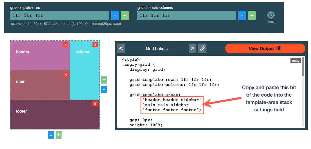
"header" "main" "sidebar" "footer" | "header header sidebar" "main main sidebar" "footer footer footer" |
| Here would be our template for small devices. Here we are saying that we want 4 rows each with a single column. | On larger devices we are saying that we want 3 rows each with 3 columns. You can see too that by repeating names we can set areas to span multiple columns and / or rows (i.e the header and main sections both span 2 columns and the sidebar area spans 2 rows). |
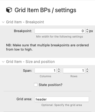
With these defined areas in place, all we then need to do is add 4 grid items and assign each to one of the named areas. The image below shows how we would do that for the grid item that we want to be located in the area that we have named 'header'.
Without any further settings needing tweaked the grid items will move to their named areas in the grid at each breakpoint. And of course we could add as many different grid set ups as we wanted - this example just demonstrates the process for 2. (You will find this example in the demo project - where we also outline how to set up the grid to take up the full screen etc).
Adding template area definitions to the stack
As you can see from the example above, adding the required syntax for the template area is fairly simple. A couple of things that you need to keep in mind though are:
- Any areas that you define have to be square / rectangular in shape - i.e. you cannot have named areas in the shape of an L
- Each row needs to have the same amount of columns referenced. If you want to have a blank column with nothing in it then add a dot(.) instead of a name wherever that should be
If you break any of these rules then the grid will be invalid and won't be created as you intend.
Tip: If you are typing these into the stack settings directly and you want to have each row string on its own line in the text field then you need to use option-enter to get to each new line (this is not required though - it is purely if that is a visual preference).
Using a grid code generator
Alternatively, there are countless online grid code generators that you can get to do this part for you if you wish - and you would simply copy and paste the generated code (for the grid-template-areas bit) into the stack. Here is an example built using an Angry tools generator for the above example:
Do we still need to add column and row definitions?
A common option if using the grid-template-area approach is to simply set the column and row definitions to both be 'Auto'. This will build out the grid based on the template areas definition and the added content. If you want more control than that then you can specify exactly how you want the columns and/or rows to be created. For example, in the full page example described above we may want our sidebar area to be a set width on large screens instead of a flexible width. In that case, for the desktop breakpoint, we could create a column definition of 1fr 1fr 200px - which is saying that we want our 3rd column (i.e. the sidebar in this example) to be a fixed width of 200px and for the other 2 columns to be equally split between the remaining space. We may also want to set up a row definition of e.g. 100px 1fr min-content at our desktop breakpoint so that the header is a fixed height of 100px, the footer is whatever size it needs to be based on the content added to that grid item, and the main content takes up all of the remaining space.
Mix and match
As well as positioning items on a template grid by using area names you can still opt to position some items via the regular positioning method. This will be useful for when there are limitations with what the template-area approach allows you to do.
What is the advantage of grid-template-areas approach over using un-named columns and rows?
For many grid types this will make grid building a lot easier as you only need to be concerned about setting up different breakpoint setups at the grid level - as the grid items only need a single breakpoint set to state which named area it belongs to. If using un-named columns and rows to build out our grid then if we want our items to explicitly occupy a position (that it wouldn't naturally occupy) we need to position it by assigning it to a row and column (along with information about how many rows/columns to span). We then need to do this for each grid item at various breakpoints if we have a grid that alters its setup at different screen sizes. If you want more control and flexibility over positioning and spanning your grid items then in many cases you will be better building grids without a template.
Experiment with both methods though - a lot of these options simply come down to preference / workflow. Use whichever method better suits you and the grids you are building!