
Although Blobs are available as a Popper child pattern stack, it does allow you to do things that the other pattern elements do not. As such it has its very own settings section.
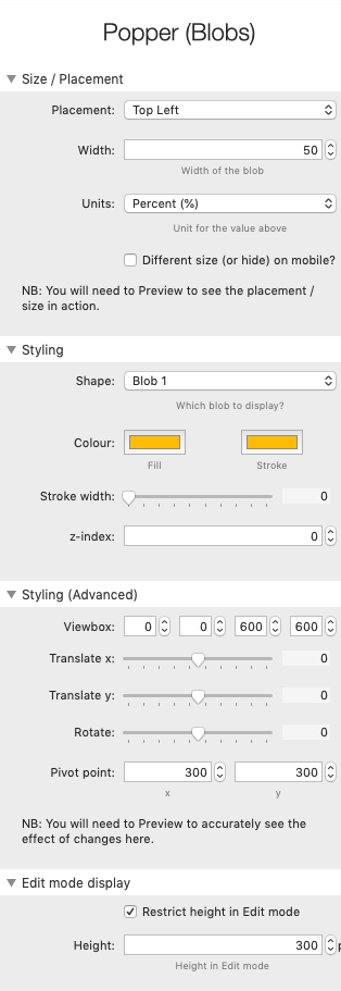
Size / Placement
Placement
You can choose from one of 9 preset positions (top-left through to bottom-right). There is also a custom option which allows you to add in your own position (as a % offset from the top-left corner).
Width
The blob is sized by setting its width - it will maintain its aspect ratio and therefore the height will be determined by the width set. The default width value is set to be 50%.
Units
This sets the units for the width value above. If a % value is used then the blob will be responsive (i.e. will scale) on different devices. If it is set in pixels (px) then it will be a fixed size.
Different size (or hide) on mobile?
You can opt to have a different sized blob on devices under a certain breakpoint. If this option is selected then further options are presented to select the size and breakpoint values. In addition, if you wish to simply hide the blob completely on mobile then there is an option to do this too.
Styling
Shape
There are 20 preset blob shapes and around 10 'other' shapes (e.g squares, triangles, stars, waves).
There is also the ability to add your own custom shape. To do this simply select 'Custom' from the drop-down menu and a field to paste in your path will become available (in the Styling Advanced group). A separate article will cover how to create your own shapes in due course.
Colour
You can set a colour for the blob fill and also for the stroke / border (if using).
These colour pickers also allow for an opacity value to be set. This can be useful when layering blobs.
Stroke
If you wish to add a stroke/border to your shape then set the width value here.
Z-index
By default, blobs are set to appear behind any added content. If you wish for them to appear above the content then you can simply raise this value to 1. If adding multiple blobs to a single stack then the order that they appear in edit mode will be the order that they appear on the page (i.e. the blob at the lowest point in Edit mode will be the one that appears at the top of the pile).
Styling (Advanced)
Viewbox
An svg viewbox essentially acts as a window through which you can see your svg shape.
All of the preset blob shapes have been drawn in a 600x600 square (the units in svgs aren't particularly important). As such, for these shapes to display as intended the viewbox has a default value of 0 0 600 600. If you create your own shapes/paths then you will need to amend these values to (e.g.) suit the size of the 'artboard' that you used.
It is worth reading online about SVGs and Viewboxes as they are a powerful concept. However, feel free to change the default sizes with even the default blob shapes to see the difference it makes.
Translate-x / Translate-y
You can move the Blob on the x-axis or y-axis by moving these sliders. Bear in mind though that this only moves the shape within its viewbox. This can be useful to make the blob appear as if it originates from off the canvas.
Rotate
You can rotate the added shape through all 360 degrees.
Note: As the blobs are irregular shapes, when you rotate a blob it may cause part of the shape to be cut off (see info about viewbox above). If this happens, and you wish to bring all of the shape back into view, then simply adjust the x and y positions as required.
Pivot Point
By default, when you rotate a shape it pivots around the centre-point (i.e 300 x and 300 y as default for our 600x600 shape). If you'd rather it pivot around another point then you can adjust the values here.
Edit mode display
In Edit mode, the blobs, like all Popper pattern elements are shown below any added content stacks. This ensures that they are easily selectable and editable. When previewed or published, the blobs will show in the absolute position selected in the placement settings. In Edit mode, there is a note of this position shown for reference.
Restrict height in Edit mode?
By default, the size of the blob in Edit mode is restricted (by restricting the available height). This is because these child stacks would be very large otherwise. Edit mode is really just to give an impression of how the blob will look (as opposed to representing the size, position).
If you want the height to be unrestricted in Edit mode then deselect this checkbox.
Height
If you'd rather the preview height in Edit mode was bigger then you can adjust the value here.