
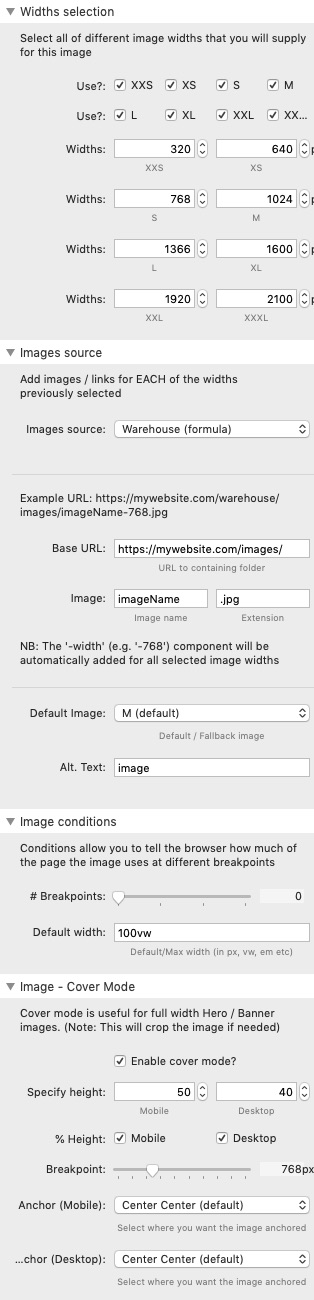
Widths selection
It is within this section that you select which image widths you wish to include for this particular image.
Srcerer stack allows you to add up to 8 different width versions of an image. The 8 default widths can be changed if required to suit the needs of your site.
If you do not wish to add all 8 versions then simply uncheck the boxes for whichever widths you are not supplying.
Images source
There are 3 option for linking to your images:
Warehouse (formula)
This is the default option and saves you having to link 8 individual images to the stack. Instead you can supply three components of the images URL and Srcerer stack will do the rest. For this to work you need to use the following format to name your images: name-768.jpg (i.e. image name followed by a dash followed by the width value)
Warehouse (links)
This option will present you with 8 link boxes. You need to supply a link for every image width that you have previously stated that you will supply.
Drag and Drop
You can use this option to drage and drop / browse for local images.
Default image
You need to supply a default / fallback image for use by browsers that cannot use the `secret` functionality. You need to select from the Small, Medium or Large widths so make sure that at least one of these is included in your image set.
Note: Of all modern browsers, only IE11 cannot properly use the code supplied by Srcerer stack. It is very well supported on all other browsers.
Alt tag
Provide your Alternative text in this area
Image conditions
By default, Screrer will generate code that will ask the browser to select an image based on the width of the screen being used. Using only this will still allow you to make good data/speed savings on small devices but adding in more information can make further improvements in these areas.
For instance, if you are using an image full width on mobile and on desktop is sits within one of 2 columns then the browser should really be basing the calculation for the desktop image on only half of the width of the screen. Srcerer allows you to add up to 3 conditions detailing the width of the image at 3 breakpoints.
Note: You need to start with the smallest width and work upwards. I.e. start with what your mobile breakpoint is and add in the width of the image for those devices, then the same for tablet and desktop.
The default width is used if no conditions are set or where none are met.
Cover mode
By default, Srcerer stack is set to display your image in 'Contain' mode which means that all of the image will be displayed.
If however you wish to use your image as a banner / Hero image, or you want to control the height of your image generally, then you can enable Cover mode.
Cover mode allows you to specify the image height (in px or % of browser height) for both mobile and desktop.