Charter - Data
This group of controls allows you to add in data values (if using local data) and also set up the styling / colours for each dataset that is added.
Tip: If using a CSV file to supply the data then it is advisable to close the 'Charter - Datasets (Data)' group as these values will be supplied by the csv and so this section can be ignored / hidden.
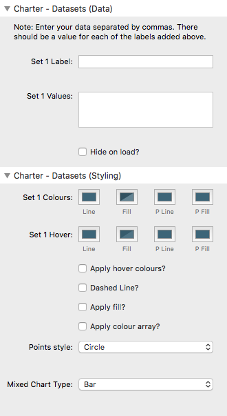
Set Label
This should be the descriptive name for what these particular values relate to. This value will be used in the legend / tooltips etc.
Set Values
This field should contain a comma separated list of numbers. There should be the same amount of values as there are labels added in the Charter - General section.
Note: It is important that you add your numerical values as a whole number without the use of commas (as commas are used to separate values). If you are using decimal numbers then make sure that you use a decimal point as opposed to a comma (if you are in a country that uses commas as the decimal separator). Although the values need to be added in this format they can be displayed in a localised format.
Hide on load?
This option allows you to specify that a particular dataset (or datasets) are hidden / filtered out when the chart loads.
This can be useful if (for example) you wish to only show the current year's data but want to allow the user to be able to add additional datasets into the chart.
Set Colours
You can specify the colour of the Line (i.e. the stroke / border), the Fill, the border of the Point and the Fill of the point. (Points are the markers that highlight a data point in Line Charts and Radar Charts)
Set Hover Colours
You can also specify the hover colour of the Line (i.e. the stroke / border), the Fill, the border of the Point and the Fill of the point. (Points are the markers that highlight a data point in Line Charts and Radar Charts)
Note: These colours will only be applied if the 'Apply hover colours' checkbox is selected.
Also note: If a custom array of background/fill colours is used then the hover background/fill value will not be used.
Dashed Line
If this dataset is presented as a line then you can opt to have the line dashed instead of being solid.
Apply fill?
This setting only applies to Line Charts and Radar Charts. All other chart types apply a fill automatically.
Selecting this will apply a fill colour beneath the line (in a Line Chart) and between the line border in a Radar Chart.
Note: If you don't want a fill in these other chart types then you can select a fully transparent colour for the Fill here.
Apply colour array?
You may wish to apply a colour array to the values. This will show each entry as a different colour. There are numerous options for choosing your colour range. There is also the option of applying a 'custom' array which is useful if you want to specify exact colours for each data point.
Note: If adding a custom array you can use HEX, RGB or RGBA values (or a mix of these). These should be placed in inverted commas and separated by commas. RGBA is useful as it allows you to add an opacity value which often works well in these charts. Example format:
"rgba(141, 72, 171, 0.8)","rgba(29, 180, 203, 0.8)","rgba(165, 24, 20, 0.8)"….
You can also use any of the html named colours. e.g.: 'red','green','hotpink,'deepskyblue'…etc
Note: Only the first dataset allows for automatic generation of colours. If using with additional datasets then these have to be added as with the custom option in dataset 1.
Points Style
Some charts (e.g. Line and Radar) use point markers to illustrate data points. There are a range of shapes available to choose from.
Tip: There is also an option (in the legend settings section) where you can opt to use these point styles in the legend as opposed to the default coloured box.
Mixed Chart type
If a 'Mixed Chart' has been selected as the chart type, then this setting can be used to specify whether this particular dataset should be presented as a line or as bars.