
When you use third-party stacks with Source then they will not (at least not yet) have a way for you to select from the Source colours that you set in the Source Base stack. You can of course just 'hard code' in the desired colour using the colour pickers. There is another way though - that uses just a little code - which means that you will link to the Source colours directly so that if you change your colour choices in future then these choices will cascade down to all your third-party stacks too.
Using CSS Variables
Source makes use of CSS variables for its colour selections. This is a really great way of being able to declare a colour once and then reference that colour by its variable name wherever we want to use it. For instance the variable for the Source accent colour looks like this --accent-color
So, if we want to use our accent colour in some custom css (or hard code it into some svg code for example), then instead of this:
.myclass {
  color: #374C5B;
}
We could use:
.myclass {
  color: var(--accent-color);
}
Note we have added the variable name inside a 'var' wrapper.
This means that the code will always be up to date with whatever is selected as the accent colour.
CSS classes
Another approach is to use CSS classes. In Source we automatically attach (some of) the Source colours to classes. This way you can attach a 'custom class' to any stack to apply that colouring to the contents. This is a great way of hooking third-party stacks into the Source colour scheme. Stacks 4 even gives us a new 'custom class' box where we can now easily attach a custom class to any stack!
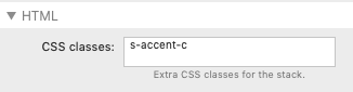
For example the class name to use the Source accent colour (to colour text) is accent-fg. To apply this to a stack we can just add this name into the custom class box like so:
If we want to add multiple colours (e.g a background colour too) we can add a second class name in the box too, simply separating names with a space.
Source colour scheme reference list
Here are all the colours that are available to you to use in this way:
| Stack settings description | CSS Variable | Foreground colour class (if available) | Background colour class (if available) |
| Accent (Main) | --accent-color | accent-fg | accent-bg |
| Accent (Hover) | --accent-color-hover | accent-hover-fg | accent-hover-bg |
| Accent (Alt) | --button-primary-color | accent-alt-fg | accent-alt-bg |
| Secondary (Main) | --second-color | second-fg | second-bg |
| Secondary (Hover) | --second-color-hover | second-hover-fg | second-hover-bg |
| Secondary (Alt) | --second-color-alt | second-alt-fg | second-alt-bg |
| Background (Page) | --background-color | page-fg | page-bg |
| Background (Alt) | --background-color-alt | alt-bg | |
| Text | --text-color-normal | text-bg | |
| Navigation (Background) | --nav-bg | nav-1-fg | nav-1-bg |
| Navigation (Active background) | --nav-bg-hover | nav-2-fg | nav-2-bg |
| Navigation (Link) | --nav-link | nav-3-fg | nav-3-bg |
| Navigation (Active link) | --nav-link-hover | nav-4-fg | nav-4-bg |
| Links (Normal) | --link-color | ||
| Links (Hover) | --link-color-hover | ||
| Border | --border-color | border-fg | border-bg |
Overlay colours
In addition to these there are also 4 overlay colours available via classes. These have different levels of opacity and are intended for use when e.g. layering grid items or other content areas.
s-dark-bgThis adds a dark background (opacity 0.5)s-vdark-bgThis adds a very dark background (opacity 0.8)s-light-bgThis adds a light / white background (opacity 0.5)s-vlight-bgThis adds a very light / white background (opacity 0.8)