
The Navigation stack allows you to add a responsive menu bar on your web page. The stack uses the default RapidWeaver navigation entries (i.e. it will show all of the pages that are set to 'show in navigation' within your RapidWeaver project).
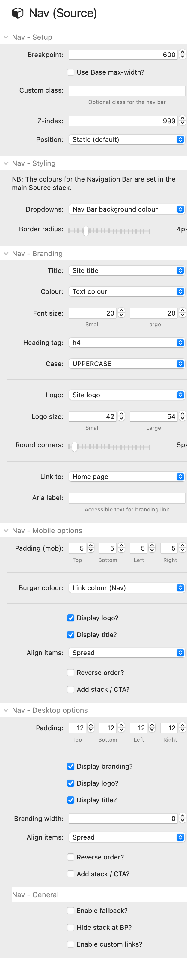
Nav - Setup
The Breakpoint setting determines the width at (and under) which the mobile (i.e. hamburger toggle) version of the Nav bar will be shown.
A default z-index of 999 is set. You can customise this value if you find other page elements that sit over it.
The Nav bar can be set to be either 'static' (default) or 'fixed'. If static then the Nav bar will move up and down with the rest of your content - wherever you have placed it on the page. If you select Fixed, then this will pin the Nav bar to the top of your page where it will always remain in view when the user scrolls up and down on the page.
Note: If using a fixed nav bar then you will likely want to add some space (padding/margin) to the top of your first stack on the page, otherwise the Nav bar will sit over some of your content.
Tip: For advanced effects with your Nav bar (changing colours, sizes, slide away) or for making it 'sticky' then I fully recommend Big White Duck's Chroma stack.
Nav - Styling
Important: All of the main colours for the Nav bar styling are set in the main Source Base stack.
Any drop-down menus will (by default) take on the same colour as the Nav bar background. You can however change this to be either the same as the page background colour or set a custom colour.
Nav - Branding
The 'branding' that you can add to the Nav bar are things like your logo and site title. By default it is the versions of these that are added to your RapidWeaver project that will be usen but you can opt to replace these with local versions on the page if you prefer.
There are also several options around what colour the Title 'link' should be and the size of the logo. You can also opt to override the default target for the branding links (your homepage) and set a completely custom one instead.
Nav - Mobile / Desktop options
For both mobile and desktop you can apply padding around all of the Nav bar elements. You can also select which branding options (if any) you want to be visible on each device.
There is an 'align items' option that lets you control how the items that you have selected to appear in your nav bar will be distributed / aligned.
There is an option to 'Add stack / CTA'. If this is enabled then you will be provided with a drop zone where you can add a stack to the Nav bar. This is especially useful for 'call to action' buttons.
On desktop is the option to 'reverse order' which will do exactly that - i.e. put the branding at the right and the nav links (or CTA) at the left.
Nav - General
Enable custom links: This allows you to add custom links that are especially of use when build one-page sites and you want to provide in-page navigation to different sections on the page. NB: This option requires the Source Addon pack as it contains the 'Custom navigation links' stack that this option requires.