
If you have Poster 2 from Instacks then you can use the Source Grid stacks to layout your blog lists instead of the inbuilt Poster options.
All 3 Source grid stacks can be used for this purpose but the best option is Grid Plus Pro as this provides some content alignment options that are not available to us when using the other grid stacks (more on this later).
NB: Using the templating in Poster 2 is an advanced feature. Likewise, this page / demo project assumes that you are an advanced user.
Examples
We have put together a sample project to demonstrate how this all works. Check out the demo pages.
How Poster 2 templating works
With Poster 2 we can use the 'templating' feature to set up a generic version of our blog post / list. When the page is previewed/published, this generic version is replicated for each Poster Item that we have added to the project. It's a great way of designing our layout once and then having it automatically be applied to all future posts (using whatever stacks we want).
With Source grids we can, for example, set up a grid to display all of our blog list items. Let's look at how to do that....
How to set up Poster / Source grids
Here is an image that shows the required structure of stacks:
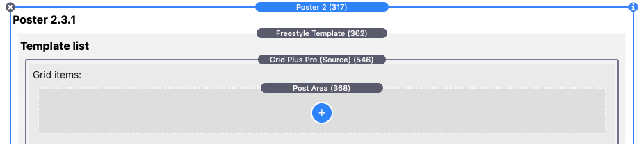
To achieve this:
- Add Poster 2 to the page
- Select 'Source Grid' (or Source Grid Plus) from the layout options in Poster 2 stack
- Remove the default RWBlog template from Poster 2
- Add a new freestyle template (list type)
- Drop the Source Grid stack into this template
- Remove the default blank Source Grid Item
- Drop a Poster 2 'Post Area' stack into the Source Grid stack (this Post Area stack becomes our Grid Item!)
Creating the template
Using Poster 2's templating feature, we set it up to how we want our items to appear. When the page is previewed/published, this Post Area / Grid Item stack is replicated for each Poster Item that we have added. The template can pull in the content that you have added to your Poster Items. This is done using macros (you can see a full list of the available macros here). What it is that you have added to your Poster Items will determine what stacks you need to have in your template / Post Area.
For images, you'll see that many of the Source demos use the Image Fit stack. This is a great option for displaying your Poster Item images as you can control the height of them (regardless of the shape / size of the original image) which is great for 'topper' images! For text, most of the demos use the Source Markdown stack (or Coder in Markdown mode) but you can use whatever stacks you like.
The best way to understand how all of this works though is just to play with it and to deconstruct the demo project files.
Styling the grid
Once we have added some content to our template (and as long as we have also added some Poster Items!) we can preview how it looks. Using the regular Source Grid stacks options you can control how many columns are displayed, how much gap there is between columns and rows, apply padding, set a drop shadow, get the item to raise on hover etc etc.
Note: Depending on how may columns you want to have you may also want to adjust the number of Poster Items per page to suit (in the Poster stack).
Grid Plus Pro
If you use our Grid Plus Pro stack then you get an extra level of control over the content's alignment. This is especially useful if your Summary content is different lengths. Normally, if this is the case then your content will appear a bit inconsistently but with Grid Plus Pro we can use the 'Justify content' options to align things how we like. See Demo 1 as an example of this. Here we group some template items together (Image Fit and the Markdown stack) using a Coder stack and leave the button ungrouped. This effectively gives us 2 items that we can then set to have 'space between' which pins the image and text at the top and pins the button to the bottom!
Customising our grids with CSS
We can get great looking blog posts / lists with just this basic setup but with just a little CSS we can take them up a level.
Spanning rows / columns
If you are using Grid Plus or Grid Plus Pro then you can add some CSS that will let you set up some of your items to span multiple columns / rows in the grid. We don't need CSS to do this with regular grid items but of course the Post Area stack is not a normal grid item - we just have one of those and therefore can't have different settings for different posts. But that is where a little CSS can come in. To help with this each individual Poster Item allows you to add a CSS class (or classes). We can then use these to apply certain styling options to only those items. For example we may want to have our first/latest Poster Item be a 'featured' item and make it span 2 columns or we may want to design a full complex grid of our items. We can easily achieve this with a little CSS.
Demos 3 through to Demo 6 all use this approach to varying degrees (Demo 6 in particular). Deconstruct these files / look at the CSS to see what is going on (there are some notes in the project to help with this too!).
Adding Poster Item images as backgrounds
There are 2 scenarios where you may want to use this technique.
Adding a background to the full post item
It can be effective in your blog list to simply use the post's main image as the entry point for the item. You can see an example of this in Demo 4. Here we have also used the title but you may wish to not add that (or to add some more content). To achieve this we simply need to add a few lines of custom CSS into our template area - in the example project we have used the Source Coder stack to achieve this. As it is a background image, unless we are adding content on top of it, we need to give our item some height. You'll see in the CSS code in the demo project we have used a min-height of 200px.
Adding a background to a specific component
It is often desirable to overlay your blog post title on the post's image. To do this we can apply the background to a container (e.g. Source Container) with some CSS (again using Coder stack) and then simply add our title into the container. See Demo 5 for an example of the code required.
Making the full grid item a link
You may wish to have the full grid item be a link to the post. This may be especially useful if you are using a background image as your list item. See Demo 4 for an example of this where we use another Coder stack to add a single line of html that will (when previewed/published) set the whole item to be a link to the item content.
Download demo project
Download the project file (requires Source, Source Addons, Poster 2 stacks)