
The Source Container stacks are what should contain any stacks/content that you add to your page. Using these lets you control how wide / how much of the page your content should take up. They also let you apply padding, margins and backgrounds to your content too.
Note: Container Plus is included in the Add-on stacks bundle and offers some more options / advanced functionality. The differences in functionality are highlighted in the descriptions below. It should be noted though that unless you need the advanced functionality / additional background options for a particular container then you should always use the regular Container stack. This one is lighter in terms of code / settings and therefore will have less impact on performance in Edit / Preview modes (not that the Plus version is particularly heavy but every little helps!).
Container tag
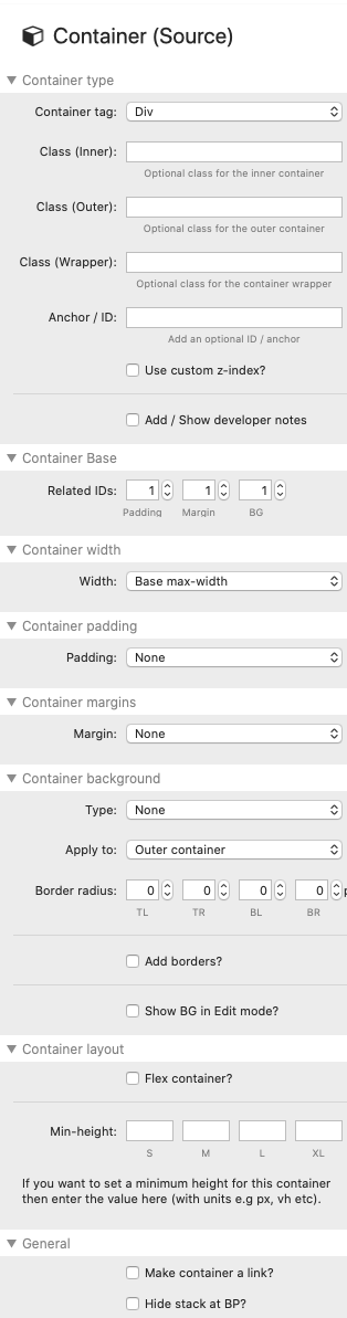
The first section in the Container settings allows you to set the appropriate semantic tag for the section that you are creating. This can help to properly structure your page following semantic rules. It is not a requirement that you use this approach however and if in doubt then just leave each as the default div.
Class
You can add a custom class (or classes) by adding values here. These can then be used to target this section with your own css. You can add a class directly to different 'layers' of the Container - the Wrapper, the Outer container and the Inner container (which is where the content is added to).
ID
You also have the opportunity to add in a unique ID for the container. This too can be used to target specific css however it can also be used to add an anchor link to this section - meaning that you can add links or buttons that take you straight to this container or a full url that can be shared that will take visitors straight to this particular part of the page.
Container Base
Related IDs
If you are using multiple Container Base stacks on the page then you can specify which set you want to reference. This can be different for padding, margins and backgrounds. Simply select the appropriate ID for each. If you then select to use Base Padding, Margins or Backgrounds in the other Container settings then they will use this ID to apply the desired stylings.
Width
You can select whether the container stack will use the 'Base max-width' setting (set in the Source Base stack), 'Full width' or 'Custom width' (where you can specify your own max-width for this particular container).
Any content added into this container will only flow as wide as the setting selected.
Padding
If you wish to add padding to your container then you can select from either the Base Basic or Advanced padding (that you have set up in the Container Base stack) or Custom padding, where you can specify a width (in pixels) for each side of the container.
Note: The Container Plus stack allows you to add 'Advanced' custom padding to the container.
Margins
Like with padding, you can opt to add either the Base Basic or Advanced margin settings (from the Container Base stack). You can also specify a width (in pixels) for each side of the container.
Note: The Container Plus stack allows you to add 'Advanced' custom margins to the container.
Background
You can add any of the following options as a background for any container stack:
- Base Background 1 or 2 (set up in the Container Base stack)
- Accent colour
- Accent colour (text) - which is the colour specified as being the 'text' component of the accent colours
- Alt. BG color (set in main Source stack)
You can also set the background to have rounded corners by setting a value (in pixels) for each corner.
Note: The Container Plus stack allows you to add an image as a background (including options for setting an overlay colour and locking/fixing the image.
Layout
Min-height
You can set a minimum height for the container - this is useful if you want to have a container that is taller than the contained content.
You can add a different height for each breakpoint. Or if you want the height to be the same on each device then you can just add a height to one box and larger breakpoints will also inherit that size.
Flex container
If you do set a minimum height for your container (and therefore have a space taller than the height of the content) then you will likely want to control the vertical alignment / distribution of the added content. You can do this by enabling the option for 'Flex container'.
Once enabled you can then select from various alignment options - e.g. centre, top or bottom. There are other options such as 'space between' which would (if you have multiple separate stacks added as content) space them out within the available height. It is worth experimenting with these settings as they are extremely useful.