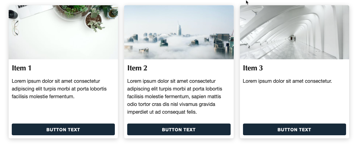
It is often desirable to create 'card' type layouts like the above where we can control the placement of things like the button to give a consistent look to each item, regardless of the amount of content used.
This could not be easier to achieve using Source - in fact the default behaviour for all of the Source Grid stacks is to have equal height items! Worth noting too that there is no javascript / equal height scripts required here! Source uses only CSS to achieve these layouts. The video below demonstrates how to achieve a column layout like shown above.


