
The Animate stack is a lightweight solution to add animated elements to your web pages. You can see it in action (and buy) it on the Animate demo page.
Animate consists of 2 stacks, the Animate (Enabler) stack and the Animate zone stack.
It can be used in any framework but there are animation options built directly into Source's layout stacks (Container, Container Plus, Grid, Grid Plus and Grid Plus Pro). This lets you animate either the full container (without needing to nest it in an Animate Zone stack) or individual grid items. Without the grid integration you would only be able to animate the content in the grid items as opposed to the actual grid items themselves.
How to use
The Enabler stack
Any page where you wish to include animations needs to have the Animate (Enabler) stack added to the page. This should only be added once.
The Enabler stack also allows you to set up some default values for the animations.
Enabler stack settings
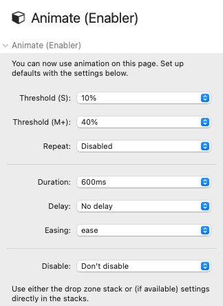
Threshold: This value determines how much of the object should be in view before the animation begins. If you are animating full containers into view then you need to be sure to set a value that will allow the animation to trigger (e.g. a Container that is taller than the height of the viewport will never animate in if you have the threshold set to 100%). You can set different values for small devices (<600px) and larger devices.
Repeat: By default, the animation will occur only once (i.e. the first time the object comes into view). If you wish for animations to generally repeat then you can set this value to be 'Enabled'. If you enable this then it is best to select a low threshold value otherwise there can be visual glitches as elements animate in and out too quickly.
Duration: How long the animation lasts can be set by adjusting the value here (options are between 200ms and 2s).
Delay: You can set how long after the threshold has been met that the beginning of the animation should start (options are between 0 and 1s).
Easing: The easing value adjusts the timing to make movement more realistic (options are Linear, Ease, Ease In, Ease Out, Ease In Out).
Disable: If you do not want to have animations to be applied on either small devices (<600px) or on all touch devices then you can select the desired option here.
Animation zone
The Animation zone stack provides a stacks drop-zone where you can drop in any stack(s) that you want to animate. The stack allows you to choose an animation 'type' and to override the default values (set via the Enabler stack) if required. As the Animation zone acts as a container / wrapper you can add any custom classes that you wish.
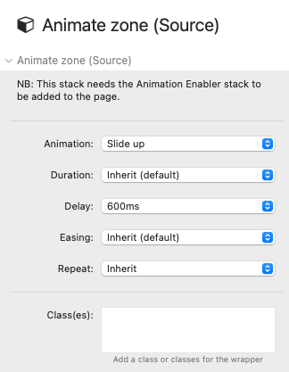
Note: The Source layout stacks have these same options built in and should be used if you want to animate e.g. the whole Source Container or any Source Grid Items.
Tips
You can nest Animation zones within other animated items. You will need to adjust the delay value of the nested animations so that they do not begin until the parent animation has occurred.
It is generally best to have the Repeat option disabled as default. This can be overridden on an individual basis if there are particular animations that you would like to repeat.
If you are not animating in Containers then you may be able to use a higher threshold value if you want to delay the start of the animation. A better approach though is setting a low value and then adding delays to the animated elements. Experiment to see what works for you.
The Flip animation types can work well for certain types of content but, depending on how they are set up, these can produce visual glitches at times. I'd advise using this animation type sparingly.
If you want to set different default values (for delay, duration and easing) for different device sizes then you can do this via CSS. Example below will set up different values (than set in the Enabler stack) for devices under 600px:
@media (max-width:600px){
:root{
    --sal-duration:.7s !important;
    --sal-delay:.3s !important;
    --sal-easing:linear !important
    }
}