
Image setup
The first batch of settings let you setup the images to be used. Note: You should use the same size of images for best results!
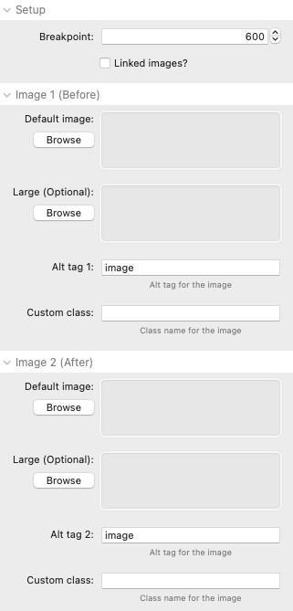
Breakpoint: This sets the breakpoint at which several of the other settings will be applied (i.e. large images, large height, large label font etc)
Linked images?: This option allows you to link to images in RW resources or to a location on your server (by providing the direct url to these)
Default image: A default image (for image 1 and 2) is required. If a secondary large image is not provided for these then this default image will be used for all devices.
Large image (optional): A larger version of the images can optionally be added. If supplied then they will be used for devices that are above the breakpoint set in the Setup section.
Alt tag: You can give each image a descriptive alt tag to aid accessibility
Custom class: If you want to target styling to one or other of the images then you can add a class name into this box. See our demo page for some examples of what can be done with this (also included in the project download).
Control line settings
The following settings affect the control line and arrows that the user controls to show/reveal the underlying image.
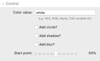
Color value: This field accepts any valid css colour value. It can be a HEX value (e.g. #FFFFFF) or a named color (e.g. white) or a CSS variable (e.g. var(--accent-color)).
Add circle: This option adds a circle around the control arrows and changes the arrow style.
Add shadow: This option adds a subtle shadow under the line / circle.
Add blur: This option makes the hollow part of the circle blurred.
Start point: This value is the % from the left (or top) that the control line starts at.
Label settings
Adding labels to the images in an available option
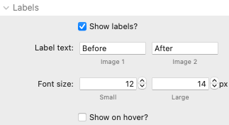
Show labels: Selecting this option enables all of the other settings in this group
Label text: The desired text for the labels can be set here
Font size: The font size for the labels can be set here (the large value will be applied at the breakpoint set in the Setup settings)
Show on hover: The labels can be hidden by default and only shown when the user hovers over the image
Options
Additional options are available
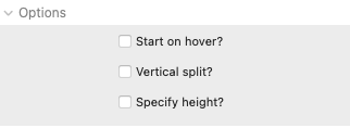
Start on hover?: Instead of the user having to grab the control line (or click on the image) the interaction can be set to start automatically when the user mouses over the images
Vertical split: The default is for the secondary image to be revealed left-to-right. There is an option though to use a top-to-bottom approach instead
Specify height: The default is for the images to display at their natural size but you can override this by specifying a height (for small and large devices). Note: This approach uses only the small image set in the image settings so this one should be of sufficient quality for all devices.
Content
There is an option to add some content over the images. Due to limited space it should only be a small amount of content used.
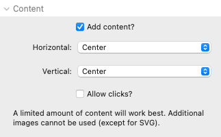
Add content: If this option is enabled then a drop zone is added to the stack in Edit mode. You can add your desired content in here - e.g. a title and / or a button etc. You can add any content that you like with the exception of additional images (though SVG images can be used if desired).
Horizontal and Vertical: There are options to place the added content left, centre or right and top, centre or bottom
Allow clicks: You will want to enable this if you have added a button / link to your content, otherwise it is best left disabled.
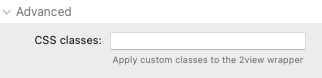
Advanced
Finally, there is an option to add a custom class name to either style the 2 view stack (e.g. to add a drop shadow etc) or to target via CSS for any other reason.
Project download
Download the latest version of the demo project file