
Magic Mouse 2 allows you to add some engaging cursor effects to your projects. Before getting into the settings it is worth just clarifying some basics around how the stack operates.
Stack overview
Magic Mouse modes
There are 4 basic modes that the Magic Mouse cursor can be in, depending on conditions that are set by the user. These are:
- The basic mode - how Magic Mouse looks at most times on the page (i.e. when not over an element that uses one of the following modes)
- The 'pointer' mode - how it looks when over a link or button
- The text mode - when some text content is added to the cursor
- The icon mode - when an icon is added to the cursor
Magic Mouse rules
Each of these modes can be triggered when the cursor is over any element on the page. By default, only the basic mode and the pointer mode are used (the pointer mode is set automatically for buttons and links - though this can be turned off if desired).
To assign different modes you use the Magic Mouse 2 Rules stack. This enables you to specify exactly what elements you want Magic Mouse to behave differently when over. For example, you might set it up so that when the cursor is over any items in a blog list text that says 'Read more' is shown.
Magic Mouse states
There are default states (or styles) that are applied to each Magic Mouse mode which are set in the main Magic Mouse 2 stack. These styles can be overridden though through the addition of one or more Magic Mouse 2 Style stacks.
Stack settings
The following settings are all found in the main Magic Mouse 2 stack. For settings related to the Rules or Styles stacks please refer to their dedicated support pages.
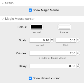
Show Magic Mouse: When this option is enabled the Magic Mouse cursor will be visible as default. The alternative is to have this disabled and only show the Magic Mouse cursor over certain elements on the page.
Colour: The Normal colour is used by default as the cursor colour. An 'Inverse' state can be applied to any mode for certain elements and at those times the inverse colour will be used. The Inverse colour is also used as the text/icon colour when in those modes.
Scale: The Magic Mouse cursor is 48px in size. This is then scaled down or up when the cursor is in different modes / states. The click value is the size of the cursor when the mouse is clicked.
z-index: If you want the Magic Mouse cursor to appear on top of all other elements on the page then you can adjust this value if need be.
Delay: This value dictates how far behind the actual mouse movements Magic Mouse follows. A delay gives a nice effect - especially if also showing the default/native mouse cursor.
Show default cursor: If you want to display the default/native mouse cursor in addition to the Magic Mouse cursor then select this option. Note - each rule can override this default option on a case-by-case basis.
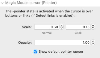
The default styling of the Magic Mouse cursor for when over links and buttons can be set here. Note: these will only be applied if the 'Detect links' setting is enabled in the Advanced section of the stack settings.
Scale: The size of the cursor when over link and button elements.
Opacity: The level of opacity can be set which will determine how much transparency there is. A value of 1.00 is for no transparency whereas a value of 0 would be full transparency.
Show default pointer cursor: The default pointer cursor for links and buttons is generally a pointer/finger cursor. If you do not want that to be shown with Magic Mouse then it can be disabled here.
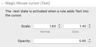
This styling is applied when a rule sets the cursor to include a text element.
Scale: The size of the cursor when over link and button elements.
Opacity: The level of opacity can be set which will determine how much transparency there is. A value of 1.00 is for no transparency whereas a value of 0 would be full transparency.
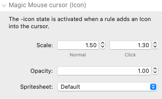
This styling is applied when a rule sets the cursor to include an icon element.
Scale: The size of the cursor when over link and button elements.
Opacity: The level of opacity can be set which will determine how much transparency there is. A value of 1.00 is for no transparency whereas a value of 0 would be full transparency.
Spritesheet: A default icon set is available with Magic Mouse 2. You can view the icons that are available with that here. If you would rather use your own icons then you can link this stack to a spritesheet that contains them. See the dedicated tutorial page for instructions about creating and adding your own spritesheet (coming soon). The desired icon from the spritesheet can be specified by adding the name of the icon in the Rule stack.
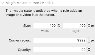
This styling is applied as default when a rule sets the cursor to include an image or video element.
Size: This sets the size of your image / video. Note that the media will fill whatever space is assigned - it does not need to match the media's size (though if you want to see the full image/video then you should specify the appropriate dimensions to display the media in the correct aspect ratio).
Corner radius: To have a circle then leave this value at a high value (and have the width and height values be the same). Otherwise you can adjust this value to whatever you like.
Opacity: You can adjust this value so that the media is slightly transparent. Though note that you can also apply blend effects to the cursor that can offer alternative solutions.
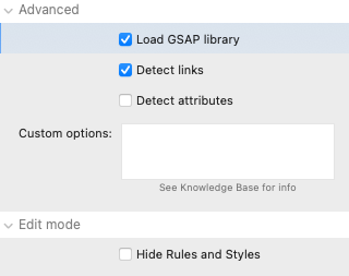
Load GSAP library: Magic Mouse 2 uses GSAP (Greensock) library. There are some other stacks available that also use this library. If you are using any of them you can disable GASP being loaded by Magic Mouse.
Detect links: This option finds all links and buttons on the page and applies the 'pointer' mode to them so that they pick up the styling associated with that mode. If you disable this then you can specify your own rules for these things. Additionally, in the Rules stack there is an option to remove the automatically added pointer state from an element so that it can be more easily styled in another way.
Detect attributes: Specifying different modes would generally be achieved by using the Rule stack(s). You can however (if the stacks that you are using allow it) add particular data attributes to the HTML. This can be useful if there are a lot of different modes that you want to set which would require a lot of rules to be added. If you are not using this approach though then it best left disabled. Details around how to use data attributes will be published soon.
Custom options: There are some additional settings that some users may find useful. Instead of adding a stack setting for all of these they can instead be passed in via this box. This could be to change the easing effect of the cursor or to disable the skewing of the cursor shape when moving etc. Details around the available options will be published soon.
Hide rules and styles (Edit mode): If you have added a lot of Rules and Styles stacks then you may wish to hide them from view in Edit mode to save some space.