
When you add an Easy Grid stack to the page a single Easy Grid Item stack is also added. You can add as many of these as you need by clicking on the blue + button in the Edit window.
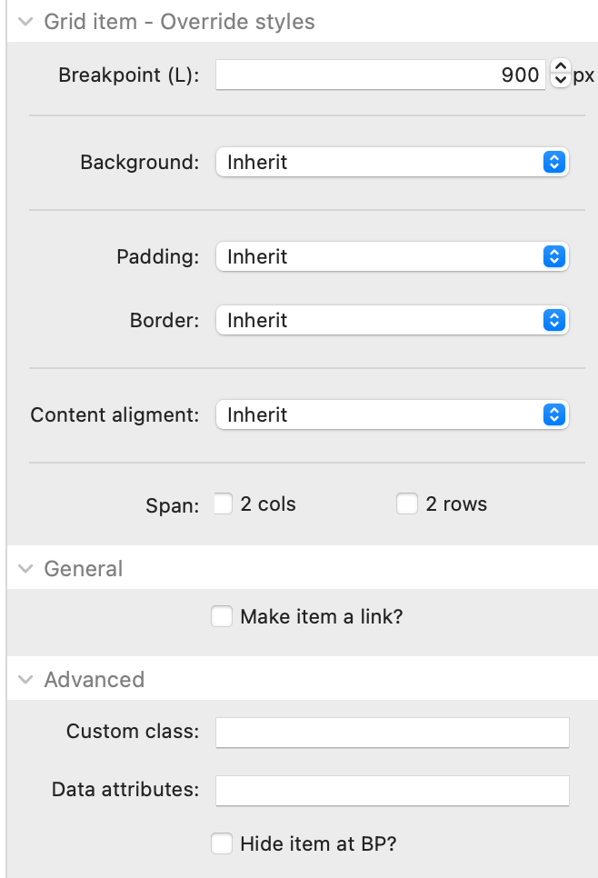
Breakpoint: This is the breakpoint at which some of the override styles will be applied. It should generally be set to match your large breakpoint value in the parent grid but it doesn't need to.
Background: You can opt to override the globally set background here - either with a new colour or with an image (local or warehoused)
Padding: If you want this grid item to have different padding values than the globally set values then you can set them here.
Border: If you want this grid item to use different border width values than those set globally then you can do so.
Content alignment: If you want the grid item to use a different Content alignment than the global value then you can set that here
Span: You can set any individual grid item to span 2 columns and/or 2 rows. This is a great way of breaking up a block grid.
Make item a link: This would be especially useful when displaying in grid mode but in any case it allows you to assign a link that will apply to the full area of the Filter Content container.
Custom class: You can add a CSS class name here to allow you to target additional styling etc. It is here too that you would add any of the available Easy Grid utility classes that can be used to specify how many columns and / or rows the item should span (including at different breakpoints).
Data attributes: If you want to add any additional data attributes to the html of the Filter Content wrapper then you can do so here. An example use case may be if you use an Animation stack (such as my own one) then you could add some data attributes here that would animate any hidden content back into view.