
If you have Poster 2 from Instacks then you can use Easy Grid to layout your blog lists instead of the inbuilt Poster options.
Easy Grid offers some 1-click options that work really great with Poster 2 - including content alignment and the option to break out of a regular block grid by selecting some interesting spans!
NB: Using the templating in Poster 2 is an advanced feature. Likewise, this page / demo project assumes that you are an advanced user.
Examples
We have put together a sample project to demonstrate how this all works. Check out the demo pages.
How Poster 2 templating works
With Poster 2 we can use the 'templating' feature to set up a generic version of our blog post / list. When the page is previewed/published, this generic version is replicated for each Poster Item that we have added to the project. It's a great way of designing our layout once and then having it automatically be applied to all future posts (using whatever stacks we want).
With Easy Grid we can set up a nicely styled grid to display all of our blog list items. Let's look at how to do that....
How to set up Poster / Easy Grid grids
Here is an image that shows the required structure of stacks:
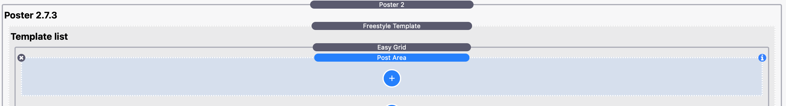
To achieve this:
- Add Poster 2 to the page
- Select 'Easy Grid' from the layout options in Poster 2 stack
- Remove the default RWBlog template from Poster 2
- Add a new freestyle template (list type)
- Drop the Easy Grid stack into this template
- Remove the default blank Easy Grid Item
- Drop a Poster 2 'Post Area' stack into the Easy Grid stack (this Post Area stack becomes our Easy Grid Item!)
Creating the template
Using Poster 2's templating feature, we set it up to how we want our items to appear. When the page is previewed/published, this Post Area / Grid Item stack is replicated for each Poster Item that we have added. The template can pull in the content that you have added to your Poster Items. This is done using macros (you can see a full list of the available macros here). What it is that you have added to your Poster Items will determine what stacks you need to have in your template / Post Area.
Most of the demos are built using Source so that we can style things nicely. You can though use Easy Grid in any framework and use whatever stacks you like to build out the content.
For images in the demos, you'll see that many use the Source's Image Fit stack. This is a great option for displaying your Poster Item images as you can control the height of them (regardless of the shape / size of the original image) which is great for 'topper' images! For text, most of the demos use the Source Markdown stack (or Coder in Markdown mode) but you can use whatever stacks you like.
The best way to understand how all of this works though is just to play with it and to deconstruct the demo project files.
Styling the grid
Once we have added some content to our template (and as long as we have also added some Poster Items!) we can preview how it looks. Using the regular Source Grid stacks options you can control how many columns are displayed, how much gap there is between columns and rows, apply padding, set a drop shadow, get the item to raise on hover etc etc.
Note: Depending on how may columns you want to have you may also want to adjust the number of Poster Items per page to suit (in the Poster stack).
Content alignment
With Easy Grid stack you get to control the content's alignment. This is especially useful if your Summary content is different lengths. Normally, if this is the case then your content will appear a bit inconsistently but with Easy Grid we can use the 'Content alignment' options to align things how we like. Here we group some template items together (Image Fit and the Markdown stack) using a Coder stack and leave the button ungrouped. This effectively gives us 2 items that we can then set to have 'space between' which pins the image and text at the top and pins the button to the bottom! Again you can use any stack you like instead of Coder (any regular container type stack will do the same thing).
Customising our grids
We can get great looking blog posts / lists with all the default settings which will create a nice regular block-style grid. You can though, with 1-click, set the Poster items to display in some more interesting ways.
Using spans
Easy Grid has a built-in 'Spans' control that lets you choose from a number of options. A simple one is to set the very first grid/blog item to span 2 columns instead of the default 1. There are a host of other options to try out too - simply change this setting and see how things look. Remember as well as this setting you can also change the number of columns Easy Grid is set to use (and also the number of Poster List items you want to display on a page) - changing these things will give you some radically different results. Experimentation is key!
And all of this is set to work only on larger devices (above the large breakpoint value that is set in Easy Grid). This means that your list items will all revert to normal spans on smaller screens!
Download demo project
Download the project file (requires Source, Easy Grid and Poster 2 stacks - Source Addons are optional)