
Charter - Chart 'Accessories'
These groups provide options for some of the chart accessories such as: Titles, Legends and Tooltips.
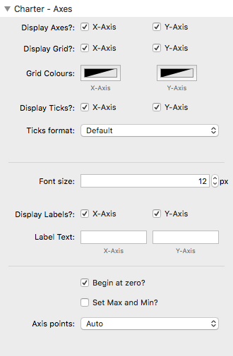
Charter - Axes
Display Axes?
These checkboxes allow to toggle the inclusion of axes on your chart.
Note: If you opt to not include an axis (or axes) then the remaining options in the Axes section will not be included either.
Note: You will want to turn off each axis in certain chart types where it performs no function (i.e. Pie, Doughnut and Polar Area charts).
Display Grid?
This option allows you to select whether or not to include gridlines in your chart. If they are displayed then you can set their colour using the 'Grid Colours' option.
Display Ticks?
Ticks are the little lines that extend from the axis of the chart towards the labels. You can opt to show or remove these.
Ticks format
If you want the numerical values on your axis to be formatted in a particular way then you can do so here. This allows you to 'localise' the number (i.e. add in thousands separators etc). You can also opt to add in text before and/or after the value which is useful for adding units (i.e. for currency or percentage etc).
Display Labels?
You can add a descriptive label to one or both axes. If selected then the text from the labels input fields will be displayed against the stated axis.
Begin at zero?
Depending on the values that your dataset contains the starting point on the axis may not be zero. If you want to ensure that your axis starts at zero then this option should be checked.
Set Max and Min?
Charter automatically calculates what it thinks the maximum and minimum values on the axis should be but if you want to override this then you can select this option and type in your desired values.
This is useful for charting things like scores that are out of (e.g.) 100 but if no one scores more than 80 then the max value will likely be 80. In this case it would probably be preferable for the max value to be 100.
Axis points
You can override how many points are used along the length/height of the axis. You can do this either by specifying a maximum amount of values that you want to show or by specifying the 'step size'/increment value.
Charter - Legend
Include legend?
A legend lists labels against the colours used so that it is easy to identify what data points that you are looking at. This checkbox allows you to either show or hide the legend.
Note: In Charter, the legend also acts a filter mechanism. Clicking on any of the legend labels toggles the visibility of that dataset. When this occurs the remaining datasets may animate to take up any new space available.
Legend position
You can choose to position the legend at the top, bottom, left or right.
Legend width
This setting controls the width of the coloured boxes.
Legend font size
You can adjust the font used within the legend to suit your needs.
Use point styles?
If using different points (in a Line or Radar chart) then you might want to use these in the legend instead of the coloured boxes. This checkbox lets you do just that.
Charter - Title
Include title?
If you want to include a title within the chart area then select this option.
Title position
You can choose to position the title at the top, bottom, left or right.
Chart Title
The desired title of the chart can be added here. It shares the same value as the Chart Title field in the Charter - General setting section.
Title font size
You can adjust the font used for the title to suit your needs.
Title Padding
The value here adds padding to the top and bottom of the title.
Charter - Tooltips
Include tooltips?
Tooltips are the little information bubbles that appear when you mouse over a chart (or tap a chart on mobile).
Tooltip Mode
Instead of the tooltip just displaying the value for a single data point, you can also opt to show all values that have the same index / category or that are from the same dataset as the value being interacted with.
Colours
You can set the colours for the tooltip background, border and font.
Font size
You can determine the font size used in the tooltips here.
Tooltip content
If you want the numerical values in your tooltips to be formatted in a particular way then you can do so here. This allows you to 'localise' the number (i.e. add in thousands separators etc). You can also opt to add in text before and/or after the value which is useful for adding units (i.e. for currency or percentage etc).
Note: There is the option (advanced) for adding in your own code to specify what you want the tooltip to display. This could be (for example) the total value of a stacked bar chart or the percentage value in a pie chart. Some example code snippets are provided with the example project download and you can find others online.
NOTE: Advanced tooltips of this kind are unsupported by me and for use only by users that are comfortable with coding of this type.
Charter - Accessiblity
You can (and should!) provide a chart description that can be used by screen readers etc for occasions that your website visitor cannot see the chart that is displayed. The description should ideally outline the content of the chart. It can also be advantageous to also provide tabular data on your web page as this will make the data visible to those with visual disabilities too.