The Dark Mode stack is available in the Source Addon Pack
The dark mode stack enables you to present a differently styled version of your page to those that prefer to use their computers (and applications) in dark mode.
Source does not use a gimmicky toggle to switch between light and dark modes. Instead it uses the user's preference for dark mode...
In summary then, for dark mode to be shown to your web page visitor, the following conditions need to be met:
- a compatible OS (e.g. Mojave) and have set their preference to be 'dark mode'
- a compatible browser is being used (e.g. Safari, Firefox and Chrome are currently supported.)
NB: This is currently only available in certain operating systems and in certain browsers. It is gaining traction rapidly however and should be in all major browsers very soon. You can see a list of what browsers currently support the dark mode preference here. Where people don't have a preference for dark mode, or if they are using an incompatible browser, then they will simply be shown the default stylings from the base stack.
Recommended reading: We wrote a Dark Mode blog post with some tips and advice about 'designing for the dark'!.
Overview video
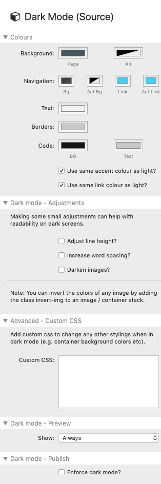
Colours
The colour options here are exactly the same as used in the base stack. Adjust the defaults to suit your needs.
With dark mode it is important to choose appropriate colours as a pure black background with white text will not be very comfortable to read. It takes more thought / work to get this right than when designing for regular / light mode. The default colours provided are based on colours that have good readability for dark mode.
In the colours settings you also have the option of whether to use the same accent colours in both light and dark modes. This provides a nice continuous piece of styling throughout both modes and is useful to maintain your brand in both scenarios. You can however change it if you wish and use different accent colours in both modes.
Adjustments
It is generally not as natural or as easy for people to read light text on a dark background as it is for dark text on a light background. There are some options offered though that, although subtle, can make a big difference in terms of comfort and readability.
Adjust Line height
You have the option of adjusting the line height from what is used in light mode. It can be easier on the eyes if there is a bit more spacing between lines of text.
Adjust word spacing
Similarly, checking this box will very slightly increase the spacing between words on the page.
Darken images
Images can suddenly look very bright when viewed on a dark background. Checking this box adds an opacity value to all images on the page so that (when sat on a dark background) they will appear to become a little darker. This is again a very subtle, but effective, adjustment.
Additionally, and not a setting here, there is code in the background that will let you 'invert' the colours of an image. For certain images this too can work really well in dark mode. To enable this you need to add a custom class (e.g. in the container stack that contains the image(s)) of invert-img. Any images that are in that container will be inverted when viewed in dark mode.
Custom CSS
Anything that uses any of the colours set in the base stack will be changed automatically to the dark mode alternative. There are times though when you use need to use custom colours (or backgrounds) and, in dark mode, these will not change. It is important therefore when choosing your custom colours / backgrounds that you consider how they will look in both styling modes. If there are some that do not look good in both modes then you can opt to change them by adding in some custom css to target these items. All css added here will only be applied when the dark mode conditions are met. You could for example change background colours, font colours, background images / gradients etc.
You can of course also use the custom css box to change other items such as font or font size etc.
Preview mode
There are 3 options with regards to how Dark Mode will (or won't) show in Preview mode:
Always: This setting will force the dark mode options to be used in Preview. It is therefore most useful when setting up your colour scheme etc.
In compatible browsers: This setting will put Dark Mode into the same mode as when published. As such it will only be seen if Previewed in a compatible browser (which includes the inbuilt RW preview) and if YOU have enabled a preference for Dark Mode in your Mojave + Mac OS.
Never: This setting will prevent the Dark Mode stylings from being applied in Preview mode. This is most useful once you have got everything styled as you wish and simply want to continue to Edit/Preview using the regular colour scheme / settings.
Publish mode
You have the option to 'enforce dark mode'. This will publish the dark mode stylings to be used as default (regardless of user's preference). This mode is really only intended for demonstration purposes - i.e. to show how the dark version of a site would look to a client (without them needing to meet all of the conditions). If you want a dark site as standard then you should simply style the base stack with these styles accordingly.