
Splider offers the option of displaying your slides in a grid format. View demo.
Splider grid settings
If you want a Splider instance to be set out in a grid format then you first need to 'Show grid settings' using the option in the 'Extension - Grid' section of the stack settings.
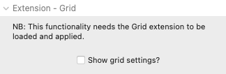
When this box is checked then new grid-related settings will be made available in the 'Setup - Default' section of the slider settings (and also for each of the breakpoint settings). There are 2 approaches of using grids in Splider - the first is by setting a regular number of columns and rows (which can be set to be different at each breakpoint) or alternatively you can use your own 'custom array' allowing you to create a more irregular grid format.
Regardless of which option is used, how this works is the same. Basically the actual slider setup remains in place (gapping, how many slides per page etc) but the child slide stacks that you add are then distributed in a grid format within these 'invisible' parent slides. It may sound complicated but as soon as you look at the demos or try it for yourself it should make sense.
Note: In Splider 1 the grid-related settings are revealed by clicking on 'Enable grid?' in the Slider setup group of settings.
Regular grid set up
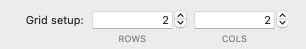
If a grid is enabled then the default values will generate a 2x2 grid. With this setup, 4 slides will be visible within each parent slide. A different grid setup can be applied at each breakpoint. NB: If a custom array is used then this will override the values set here.
Custom array setup
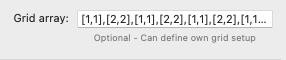
By applying a custom array we can break up our grid a bit and have a different setup applied for each 'parent' slide. This is done by applying an array of values, each of which will be applied to whichever parent slide it relates to. In the image above we can see that we have the following array: [1,1],[2,2],[1,1],[2,2],[1,1],[2,2],[1,1],[2,2],[1,1]. Here we can see that for the first parent slide we have [1,1] which is 1 column and 1 row - i.e. a single slide will fill the whole space. In the second we have [2,2] which gives us 2 columns and 2 rows - meaning that this slide will display the next 4 Splider slide stacks. This then repeats for as many as we need with each set of values separated by a comma. Note: The array does not have to cover the number of child slide stacks added. Any additional ones that are not covered by the array will pick up the same value as the last one listed in the array. Likewise, you can supply an array that is longer than the number of available slides - any that aren't required will simply be ignored.
IMPORTANT: If a custom array is applied (in the Setup - Default settings) then this same array will be inherited at any breakpoints that are used. If you wish to use a different setup at different breakpoints then you will need to supply new arrays for these too. If a custom array is used then the default grid setup (columns and rows values) is ignored at all breakpoints.
Enable grids
IMPORTANT: Before a grid setup can be used the Grid extension needs to be enabled. Please refer to our dedicated Extensions article for more details
In Splider 1 grids are enabled using a different method: For any grid settings to be applied, a separate Splider Grid Enabler stack needs to be added to the page. This can be added via any existing Splider stack by clicking on the Add (blue plus) button and selecting the Grid Enabler stack. Only one of these needs added to the page, regardless of how many Splider instances you are wanting to use in grid mode. It doesn't matter which Splider stack is used to enable it and if you wish you can even move it out of the parent Splider stack.
Tips and tricks
You will need to pay more attention to the content that you use in grid sliders (and how much content you add). It won't be an appropriate approach for most use cases but it can be really effective for certain needs (view the demo to see a few examples).
In addition you may wish / need to add some additional height to Splider for the grid items to be displayed as you wish. This can be done by specifying a height (or height ratio) in the settings.
Demo file is built using Splider 1. You can open with Splider 1 (included with v2) to view settings if you want to recreate. View our article about migrating a slider from Splider 1 to Splider 2.
There are a couple of grid examples for Splider 2 included with the demo project file included with the stack download.