
Palette is a stack that allows you (and your clients or website visitors) to change the colours used on the web page and therefore set a colour theme that is more suited to their tastes. View the product / demo page.
Palette stack settings
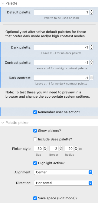
| Setting | Description |
| Default palette | Select the palette ID of the palette that you wish to use as the default palette (i.e. that one that will be shown on the initial page load). |
| Dark palette* | Option to specify a palette that would get shown by default to those that have a preference for dark mode. If you do not want / need to offer a palette specifically for this then simply leave the palette value at -1 and the regular default palette will be used. |
| Contrast palette* | Option to specify a palette that would get shown by default to those that have a preference for high contrast (set in the OS settings). Leave at -1 to not specify a palette for this scenario. |
| Dark contrast* | Option to specify a palette that would get shown by default to those that have a preference for high contrast AND dark mode. Leave at -1 to not specify a palette for this scenario. |
| Remember user selection | This option, if checked, will set the browser to remember the palette selected by the user. This uses the browser's local storage (as opposed to cookies) and is a private and secure approach. With this setting a user's preference will be retained between browsing sessions and when going between other pages on the same site that also use Palette stack. |
| Show pickers | This option either shows (or hides) the auto-generated theme picker buttons that can be displayed to users on the website. You will generally want to show these however there are other options available for setting the theme (via JavaScript - see more below). |
| Include Base palette (F6: 'Include Site Styles palette') | This option allows you to pull the default colours for the site - set in the Source Base stack (or F6 Site Styles) - into Palette and therefore offer it as an option to users for selection. Note: In the F6 version you need to add in a couple of colour choices to style the picker button in the correct colours as Palette cannot capture (and hold) those values. |
| Picker style | These settings determine the size and shape of the theme picker buttons. Note: the main colour shown in each picker button is the main (accent/primary) colour. The border that is used is the page colour (so that the user can see if it is a dark or light theme). If you do not want to show the border then simply set the border value to 0. |
| Highlight active | With this selected a dot is added to the button of the active palette. |
| Alignment | This determines the horizontal spread of the palette picker buttons (where there is space for them to spread out) |
| Direction | You can opt to present the buttons either in a row (horizontal) or in a column (vertical). |
| Save space (Edit mode) | This option minimises the child Palette Picker stacks so that they take up a bit less space in the Edit mode view. |
* If a user with a preference for dark mode changes the palette (and the option to remember user selection is enabled) then they will be shown their choice of palette in futures sessions / pages. To test these settings please preview in a browser (not in RW preview) and make the appropriate changes on your Mac's setttings (refreshing the page after any change made).
Palette picker 'child' stacks
The main Palette stack contains a blue plus (+) button that allows you to add as many theme options as you like (up to 10). The settings for the Palette Picker stack differ slightly depending on whether you are using the Source or Foundation 6 version.
Applying themes via JavaScript
In addition to (or as an alternative to) setting the themes via the auto-generated palette picker buttons, you can set up buttons or links to trigger a theme change. This is done by calling a JavaScript function called setTheme and by passing in the desired palette ID. One way of doing this is to add an 'onclick' data attribute that has the value setTheme('palette1').
Additionally, if you want the button (or link) that you are using to trigger this change to pick up a particular palette's colours then you can add the css class name for the palette (e.g. palette1) to the element that you are using. This will override the page's colours so that the relevant colours are displayed instead.
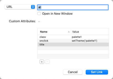
Note: the approach displayed above only works for stacks that support the addition of data attributes in this way (all of the Source stacks where you can add a link do support this).
There are example of using these approaches in the available demo project.
Demo project
Download the latest available version of the demo project for Palette