
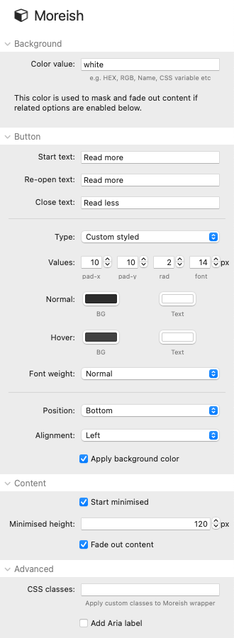
Background
The background color set here is used to mask out text behind the button and/or to fade the bottom of the content out. You will generally want to match the background color in use on your page. The default value (white) is simply a named colour value and will work for most sites. You can use any approach to define the desired colour though - a HEX or RGB colour value or a CSS variable if you want to dynamically tie in to your framework's color scheme. For instance, if using Source as your framework then you can view the associated color variables here - and to use the accent color (for example) you would add a value of var(--accent-color).
Button
The button acts as the toggle that will show and hide your content.
Start text: Add the initial text value that you want the button to display
Re-open text: You can add the same (or alternative) text for when the button returns to its minimised state
Close text: The text that should be used to indicate that the button will minimise the content
Tip: You can add symbols (e.g. html entities) as text. See the demo project for several examples of this.
Button type: There are numerous options for styling the button. The default simply lets you select values to do this (as in image above). If you are using a framework though then there are various pre-sets that allow you to use the framework's styling.
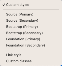
If you use a different framework or want to use your own CSS to style the button then you can select 'Custom classes' and attach the relevant class names to the button. A final option is the 'Link style' which makes the button look like a text link instead.
Position: The toggle button can be placed either at the top (default) or bottom of the stack.
Alignment: Whether at the top or bottom, the button can be aligned to the left, center or bottom.
Apply background color: This option will use the background color (specified in the initial settings field) behind the button. If you are positioning the button over text content then you will almost certainly want this option checked. Note: If your button is positioned at the top (and you are using text content) then you will probably want to add a top margin to your text content so that it can be seen.
Content
Start minimised: You can opt for the content of the stack to be initially minimised (default) or have it open initially.
Minimised height: The desired height (in pixels) of the collapsed section
Fade out content: This option is only available for when the button is positioned at the bottom of the content and it makes use of the background colour specified initially (in the top setting) to fade out the text before the button to give a visual indication that there is more to see.
Advanced
CSS classes: If you want to do additional custom styling to any aspect of Moreish and/or its content then you can add a class name in here to target those styles. Multiple class names should be separated by spaces.
Aria label: An aria-label can optionally be added into the button HTML. This provides some guidance around the purpose of the button (if the button text is not sufficient) and is used for accessibility purposes (though note that the actual content of the stack is still in the HTML even when Moreish is minimised so is always available to screen readers anyway).