
Filter stack allows you to assign a category (or categories) to any content on your page and then allow the user to filter based on their preferences to view only the content of interest.
Filter setup
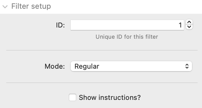
ID: If using multiple Filter stacks on a page then you must ensure that each has a unique ID.
Mode: There are 3 'modes' that you can set Filter stack to operate in. These are:
- Regular: In this mode you would just add regular stacks content into Filter stack as normal. For any content that you want to be affected by the filter buttons / categories then you should add these within a Filter Content stack (using as many Filter content stacks as you need to contain all your content for the different categories).
- Dynamic grid:You can opt to present your filterable content in a grid format. The Dynamic grid option is a good default option as it will automatically show as many columns of content as can comfortably fit in the available width.
- If Dynamic grid is selected then you can optionally specify the 'Items min-width' - this setting tells the stack the minimum width a column can be. As soon as the columns are compressed to this width the end one will wrap onto a new row.
- Fixed grid: The Fixed grid option presents the grid items in a specified amount of columns
- When this option is selected you are presented with additional options to select the number of columns that you want to show at each breakpoint (along with the option of specifying those breakpoints)
When either grid option is chosen some additional grid styling options are presented to control the gap between grid items, the border radius of grid items as well as the padding applied within each grid item.
Show instructions: This option will display some brief instructions about how to use the stack.
Filter values
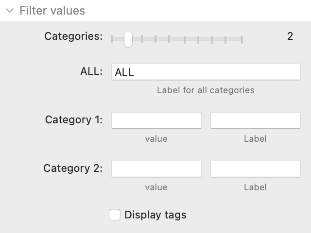
Categories: Use the slider to specify how many categories you want to define. These are the 'tags' that you will apply to content. Filter stack allows for up to 10 different categories.
ALL: This is the name/label used for the filter button that will display all content in an unfiltered way. (The All option can optionally be hidden if desired)
Categories 1 (to 10): It is here that you would define the category value (this should be a single lowercase word) and also a category label (this is what is seen by the page visitor in the filter buttons). The label can be multiple words in any case.
Display tags: This option will show the tags that have been assigned to each piece of content. If selected you are presented with additional options to control the position of the tags and how much they are offset from the edge.
Filter buttons
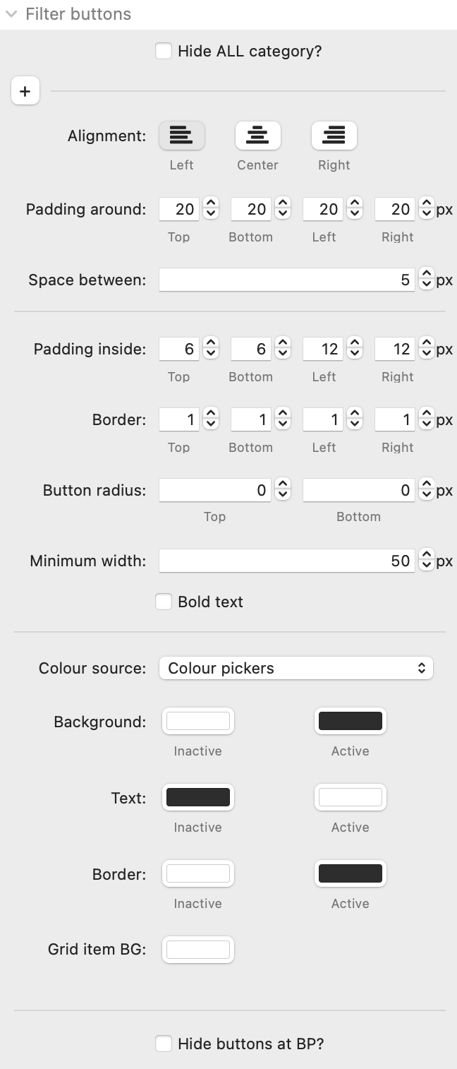
Hide ALL category: If you don't want to display all the unfiltered content then you can opt to hide the ALL category. If selected you will be prompted to select which of your categories you want to be the new default filter.
Alignment: This controls the horizontal alignment of the filter buttons. If you want the alignment to be different at different breakpoints then you can click on the + toggle to reveal the responsive controls.
Padding around: This setting determines how much space you want around the group of Filter buttons
Space between: This controls the space between each of the buttons in the row
Padding inside: This is how much space you want inside each button (controlling how big the button should be)
Border: This is the width of border around each of the buttons
Button radius: This allows you to control how curved you want the button corners to be. You can set a different value for the top an bottom (which can be useful if, for example, you were trying to replicate the look / functionality of a tab interaction.
Minimum width: You can set a minimum width that the buttons should be. This can help to provide a consistent look and feel. This setting is ignored on small devices where space is at a premium.
Bold text: Select this if you want the label text to be bold.
Colour source: The colouring of the various elements that Filter stack creates can be configured. There are 3 options in relation to colour 'source':
- Colour pickers: These use the standard colour wells/pickers to define your desired colours
- Source colours: If you are using Source framework then you can set Filter to pick up the colours that have been set there
- Colour values: This option gives you free text input fields where you can add the colour values in any format you like (HEX, RGBA or a css variable etc).
For each colour source you are able to define a colour for the button background, text and border (in both active and inactive states). You can also specify a background colour for grid items (if using one of the grid display options).
Hide buttons at BP: If you want to hide the filter buttons above or below a particular breakpoint then you can do so.
Other
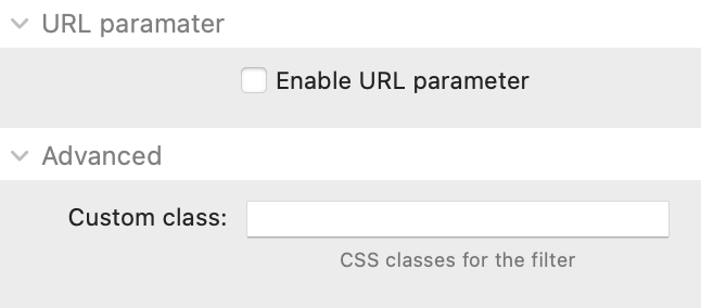
Enable URL parameter: With this option set you can pre-filter the content of the Filter stack by appending a value to the url. When selected you will be prompted to provide a name that will be looked for in the url (default is 'category'). This can then be used by you (via a button on another page for example) by appending '?category=value' to the url (where value should equal the desired category value).
Custom class: If you want to apply additional styling etc then you can add a class name (or multiple names separated with a space) here.