
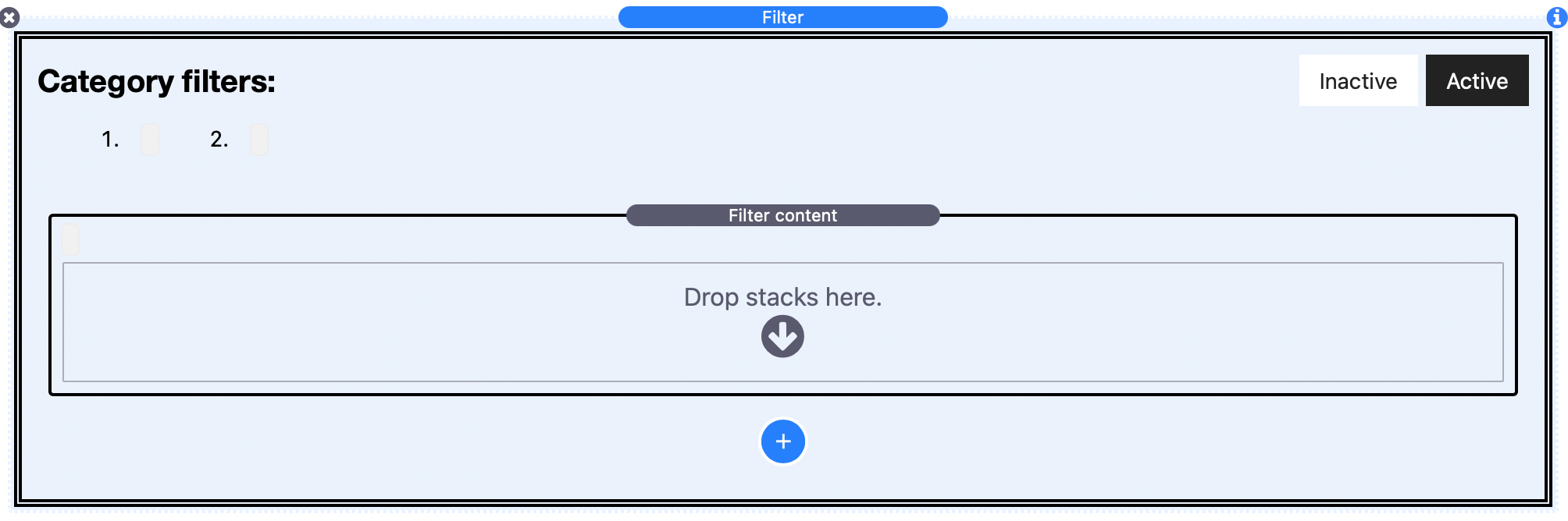
Filter Content stack is a separate stack that comes with Filter stack. If using the regular 'Mode' in Filter stack then you will need to drag this stack into Filter stack wherever you want to add content that you want to be affected by the Filter control buttons. If using either of the grid modes then the Filter content stack is added automatically and additional ones should be added to generate each grid 'item' that you want to create.
Filter Content stack doesn't do much. It is just a container that allows you to 'tag' the content within it with the different categories that have been defined in the parent Filter stack.
Filter Content stack settings
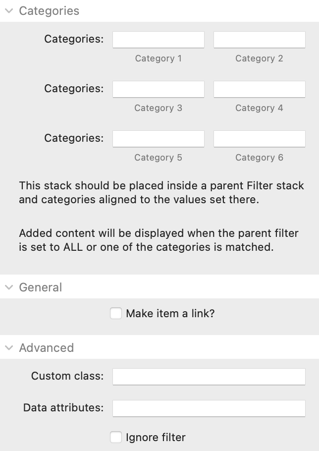
Categories: You can add up to 6 category values to the stack. These should match the value element of the categories that have been assigned in the parent Filter stack. When the parent filter is set to ALL, or a Filter category that matches a value added here has been selected, then the content contained within this stack will be shown - otherwise it will be hidden.
Make item a link: This would be especially useful when displaying in grid mode but in any case it allows you to assign a link that will apply to the full area of the Filter Content container.
Custom class: You can add a CSS class name here to allow you to target additional styling etc.
Data attributes: If you want to add any additional data attributes to the html of the Filter Content wrapper then you can do so here. An example use case may be if you use an Animation stack (such as my own one) then you could add some data attributes here that would animate any hidden content back into view.
Ignore filter: This setting may be most desirable when you are using the grid mode as it lets you add some grid items that will not be affected by the filter (i.e. so that they remain visible at all times regardless of any filter values applied). This wouldn't be needed in Regular mode as you can simply add non-filterable stacks content directly into the parent Filter stack.