
Easy Grid makes it incredibly easy to create advanced grids in RapidWeaver / Stacks. Although it is called a grid stack it is what you would use to create columns as well! This page details the setting up of the grid. We have another article that is dedicated to the options available in the Easy Grid item stack.
Grid setup
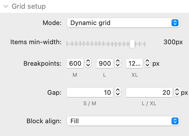
Mode: There are 2 available grid modes:
- Dynamic grid: This mode is the default and will automatically create an appropriate number to fit in the available width (of the container or page). The amount that will be displayed is controlled by a single setting - Items min-width. This value specifies the minimum width that the columns should be - as soon as the columns reach this value then the last grid item on the row will wrap onto a new row. It is a really dynamice and easy way to set up a fully responsive grid on your page.
- Fixed grid: The Fixed Grid option lets you specify exactly how many columns you want to appear (at each breakpoint). The default would be to have 1 column on small screens, 2 on medium, 3 on large and 4 on extra large. When Fixed Grid is selected a new setting is revealed to allow you to specify these values.
Breakpoints: These are the breakpoints at which the Fixed grid columns would be applied and also where some of the various styling options are applied too.
Gap: This is how much spacing you want between your grid items (horizontally and vertically). There is the option of specifying different values for Small/Medium devices and Large/Extra large devices.
Block align: Where some grid items in a row contain more content than other grid items you can control how you want the grid to handle that. The default (Fill) is to make all grid items the same size / equalise the height of each item and will generally be the best option. Alternatively though you can set the grid item blocks to sit at the top, centre or bottom of the available height.
Grid Item - Global styling
You can globally style all of the contained grid items. Each individual grid item allows for any of these values to be overridden.
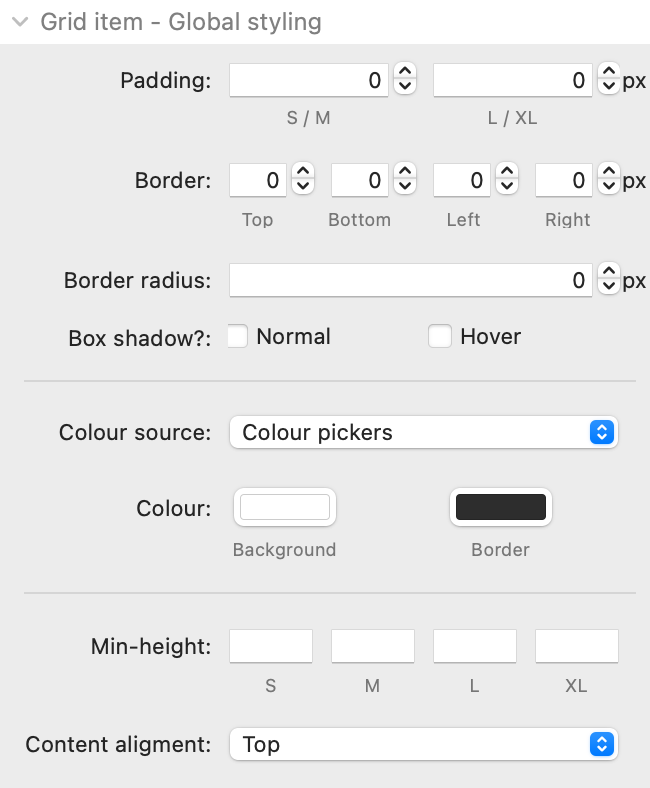
Padding: This controls padding inside all of the grid items that are added. A separate value can be specified for S/M and L/XL devices
Border: This controls the width of the border around each grid item. A different value can be set for each side of the grid item.
Border radius: You can opt to curve the corners of each grid item
Box shadow: You can opt to apply a drop shadow effect to the grid item (and a different on when a grid item is hovered over). When selected these options will display an additional field where you can set the box shadow value.
Colour source: The colouring of the various elements that Easy Grid stack creates can be configured. There are 3 options in relation to colour 'source':
- Colour pickers: These use the standard colour wells/pickers to define your desired colours
- Source colours: If you are using Source framework then you can set Filter to pick up the colours that have been set there
- Colour values: This option gives you free text input fields where you can add the colour values in any format you like (HEX, RGBA or a css variable etc).
For each colour source you are able to define a colour for the background and border
Min-height: You can optionally specify a minimum height that you want each of the grid items to be. If entering values here you need to ensure that you also add the desired units - e.g. 250px
Content alignment: You can control how any added content is vertically aligned whenever there is available space in a grid item. This will only work if 'Fill' is the selected option for 'Block align' in the main grid settings. You can opt to have the content appear at the top of the grid item (default) or in the centre or at the bottom. You can also set it to have 'space between', 'space around' or to 'space evenly'. This setting is the one that will let you easily get your content consistently aligned across every item in every row!
Advanced
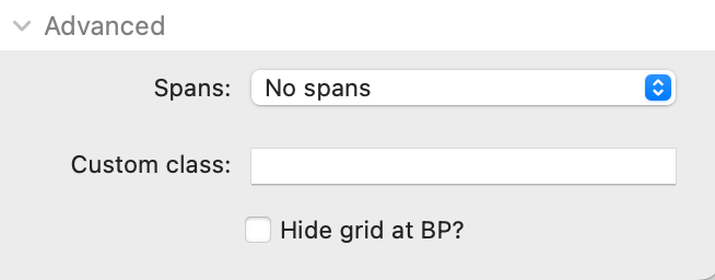
Spans: There are a few built in settings that will transform your grid from being a standard block grid to a more interesting one (where some items are set to span multiple columns and/or rows). These won't be desirable / suitable for every grid but do provide a simple way to break out of a standard block grid. All of the available options will work with any grid set up (i.e. dynamic or fixed and regardless of the number of columns used) but some will work better when a certain amount of columns are used - in those cases that recommended amount of columns is shown in square brackets - e.g. [3].
Any selected span setup will only be applied to grids on large/extra large devices (though remember that you can control these breakpoints if you want the spans applied on smaller devices too!
Custom class: You can add a class name (or names separated by spaces) here to allow for additional styling etc.
Hide grid at BP: If you want to show or hide the grid above or below a particular breakpoint then you can do so.