
Grid Plus is available in the Add-on pack.
You can set up some really stunning grids using the Source Grid Plus stack. It takes a bit of practice / learning to figure out how it works but once you have mastered it then the possibilities are endless for creating stunning grids in your RapidWeaver projects. It is worth reading online about CSS Grid as this will give you some background about the methods used in the stack.
Note: Grid Plus Pro is now available and (apart from the ability to set up a filter grid) can do all of what Grid Plus does and in a far more flexible way. It would be the recommended stack for most purposes. Check out the Source Grids Comparison table for more information.
To get the most out of Grid Plus it is strongly recommended that you take some time to view/dissect all of the available examples (including the 'Welcome to Source' project file, the included grid templates and the various project files that have been made available).
You will also find it useful to learn at least the basics about CSS Grid. We have put together a list of useful third-party resources here: https://knowledge.shakingthehabitual.com/article/74-learn-css-grid
Setup
Block align
You can opt to set the grid items to be equal height ('Fill') or to align them at the top, centre or bottom.
Note: Alignment options within the Grid Plus child stack are only respected if 'Fill' is selected here.
Column definition
Understanding this part is key to understanding how the grid works. Again, it is worth your while searching online and reading about CSS grid to give you a background. Below is an introduction of sorts however to some of the concepts.
The default is for the column definition to be 'Min width'. What this means is that the value that is stated in pixels (default 250px) is the minimum width any grid item can be. The maximum width a grid item can be depends on how many other grid items are added. If there are 2 grid items added then each will take up 50% of the available space. If there are 3 then they will each take up 33.3%. This will continue until there are too many columns for the minimum width to be respected. At this point a grid item will simply wrap onto the next row. Here's a worked example:
A Grid Plus stack has been added into a Container with a max-width of 1140px. The min-width value for any item is 250px. The gaps have been set to be 20px between columns. In this scenario we would be able to fit in 4 columns (4*250 + 3*20px = 1060px). A fifth item would not fit because another 250px would take this above our container width of 1140px. If we resize our browser then when the container width gets to less than 1060px then the fourth item will no longer fit and so it will wrap onto the next row. (View this tutorial video to see this in action).
Note: You will not generally want to set a min-width lower than around 250px otherwise you might find that you will get columns on mobile devices, which is generally undesirable. (If you do want low values then add in a breakpoint and leave the 'mobile' version at a value that ensures that your items will stack.)
The other option for column definition is 'Custom (Advanced)'. As stated in the title, this is an advanced feature but what it allows you to do is specify exactly how you want your columns set up. Here are some examples:
If you wanted to create a 12 column grid you could use: repeat(12, 1fr). What this is saying is to repeat 1fr (i.e. 1 fraction of the available space) 12 times.
You can create 3 columns like so 100px 1fr 20%. What this will do is set column 1 to be 100px wide, column 3 to be 20% of the available width wide and column 2 to take up the remaining space.
One final example: repeat(3, 1fr 2fr) would give you 6 columns 1fr 2fr 1fr 2fr 1fr 2fr (remember 1fr = 1 fraction of the available width, 2fr = 2 fractions of the available width).
Note: On top of setting out your columns like this, you are also able to set up your Grid Plus child items to 'span' multiple columns (and rows!) which lets you make some really interesting grids. More details about spanning can be found in the support page for the child stack.
Tip: If you are not placing your grid into a max-width container (i.e. your grid spans the full width of the page on any device) then using the Min Width approach you would not be able to control how many columns are produced. If you want to have your grid full page width AND want to be able to control the number of columns at all times, then you will be best using the Custom (Advanced) approach. Generally however, your grid will be in a max-width container and therefore controllable using either method.
Gaps
You can specify how much space you want to have between grid items - horizontally and vertically.
Breakpoints
You are able to specify a different column layout for different device sizes. Generally however this will not be required - especially if using the 'Min width' approach. If you do need a different layout then you can do this for up to 2 different breakpoints. Be warned though, things can get quite complex when you add multiple layers of definitions into the mix and you can quite quickly go 'down a rabbit hole' trying to get things to work as you want.
Note: If adding a breakpoint then that new column definition will be used on all devices that are equal to and wider than the stated breakpoint.
Grid Items Styling
You can opt to make some styling choices that will affect each child item. This includes adding padding, setting a background colour and borders.
You can also opt to add a shadow around each item. For the shadow to be seen you will need to have sufficient gaps between items and also sufficient padding around the grid itself.
There is also an option to 'Raise on hover' which makes your grid item shift a little when hovered over.
Anything that is set here can be overridden by any individual child item.
General
You can additionally set the grid to be shown (or hidden) at a particular breakpoint.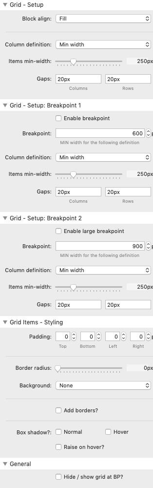
Overview video
This short video introduces you to the Grid Plus stack and begins to look at how to build complex grids using the naturally responsive min-width approach and by applying spans to the child items.